Comments on: GUI: Colored Buttons - Attributes vs Styles
I like deep GUIs.
What do I mean by that? Here's an example: I like the Apple iphone. In fact,
for the most part, the iphone looks and feels like the kinds of apps I prefer to design. But, maybe that's just my Amiga Computer background leaking out.
By deep GUI, I mean a graphical interface that provides additional
information via visual hints or clues.
For example, in the image below, which button looks more like a delete
action will take place:
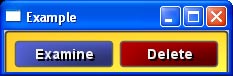
The color of the button is not critical to its operation. It's just a
visual aid, much like the syntax coloring you see in a good code editor.
It is what I call a significant visual clue because we as humans
recognize color quite well. It differentiates the button as something
special. If I had just changed the rounding at the corners it would not
be as effective.
IMO, it's silly to ignore this color dimension of our human preceptive
abilities. (If we were cats, then it would be fine.) We should use it - wisely, of course.
Now, assuming that we can change the color of a button, how do we
indicate this in the GUI?
This question is not as trivial as it seems. In R2 VID and in the
default button style of new R3 GUI, you can write:
button "Delete" maroon
That's how I got the button for the image above.
But, some of you strictly-by-the-book GUI experts will recognize that I've
violated an important rule. I've broken the abstraction barrier. In the
line above, I added a visual attribute (maroon) to an abstract concept
(button). It would be like using the B tag in HTML to stress a word. Oh no! It's verboten! Although... a whole lot of people do it... because it's convenient.
You may ask, is that a good practice? My answer would be that it depends
on your application. If you're writing a tiny reblet for some quick project
or to give away to friends on the net, I'd say: no problem. But, if you're
designing a commercial application for an important client, I'd advise for
you to be more disciplined.
More disciplined? What do I mean?
Well, quite simply, you can easily abstract the above into a new style (our GUI subclass) of button.
button-critical "Delete"
Which can be defined as easily as:
stylize [
    button-critical: button [
        facets: [area-color: maroon]
    ]
]
The advantage is that now all of your critical buttons will be the same
color and you can easily modify all of them in one place, the style
definition.
You might have another button defined for Cancel that gives you a
different color indication, and would be written as:
button-cancel
And also, this kind of button need not even contain text, because the
text would be included in its definition.
stylize [
    button-cancel: button [
        text-body: "Cancel"
        facets: [area-color: gray]
    ]
]
In conclusion, I think that a good design allows both methods. For the
quick app, users can throw in the color. For more serious apps, define
the style. Just like defining a function, it's easy, and will save you
time later.
9 Comments Comments:
-pekr-
16-Oct-2008 20:00:50 |
I don't really understand the difference. From your description and relation to HTML world it seems like using HTML vs CSS. But it is imo not like that. It is like using inline CSS vs stylesheet CSS in one place, so I find your description not beeing accurate (if I understand the problem correctly).
Does not just 'button "Delete" maroon' change the same facet, namely 'area-color here?
What I am more interested to know is, how is a button text being rendered. From docs there is no implication in stylesheet, how internal gobs are combined, rendered. So far we can see the only method of rendering being done via a draw block. So is button being a compound style combining text, and separate drawing? Or is it hardcoded text type gob over drawed block? | Carl Read
17-Oct-2008 6:06:32 |
It may not matter for quick, throw-away apps, but it'd be good if VID3 encouraged the colour-coded habit from the start. And if VID3 is going to allow global style-sheets of some kind, the critical colours need to part of that too. So needs to be a default part of VID, not just something programmers should consider including with each app they write. | Bob Warren
17-Oct-2008 18:50:09 |
Speaking about coloured buttons reminds me of something I had difficulty doing in the past. Will VID3 apply the lemma of "doing simple things in simple ways" by enabling me to change the colour of an EXISTING button without hassle? I had no trouble changing the text of an existing button, for example, but the colour was a different kettle of fish. (Or perhaps if I understood the coding structures shown above by Carl adequately, perhaps it turns out to be a silly question?) | Oldes
19-Oct-2008 16:25:49 |
I'm not sure, but I guess it will be done just by changing the facets/area-color value.
It's true, that with R2 it is a litle bit tricky, as the color of buttons is hardcoded in effects:
view layout [
  b1: btn "test"   80 red
  b2: btn "change" 80 [
    b1/effect/('colorize): random 255.255.255
    ? b1/effect
    show b1
  ]
]
| ed_b
21-Oct-2008 12:47:10 |
remember there are lots of color blind folks in the world, who might want something other than "red" to tell them its a critical function. | popper
6-Dec-2008 8:27:09 |
you all know im mad an=bout GUi's and makeing simple front ends etc, and carl as right about colour, however perhaps someone should also mention sound in the human condition too, DO we need a AUI defined or do we think about including it in the GUI sections ?
im thinking a simple click or Mp3 sound file as you mouse over or direction key onto the button your interested in making prime for that other additional information via Audio hints or clues too.
we dont have a "this is amiga speaking" say/speak device in rebol3 do we, but audio is also good for the visually impared market place and there are countrys that stipulate their official govt websites and apps be open and available for use to these disabilitys too....
| Luis.
8-Dec-2008 4:46:04 |
Here here! Or should I say: Hear hear!...
Cheers,
Luis.
| Scot
3-Jan-2009 1:08:14 |
Humans try stuff until they find things that work. Then they generalize. That's how we learn. REBOL VID allowed us to try stuff with the ability to put it in a style sheet when we discovered things that work. I use REBOL precisely because it allows me to think and learn in a human way. That's why we need to be able to change the color of a button by adding "maroon", and we need to be able to define local styles. When we get something that works we'll generalize it.
There isn't any reason a commercial developer can't discipline themselves to put everything in a style sheet and generalize all the attributes during development. But I'll bet nearly everybody uses the local styles and local attributes until they've decided what works for the design. Come on folks...fess up! | Roger Wegener
1-Jun-2009 5:48:07 |
I just love the Stylize system. I haven't yet explored it in detail - but have done things like the button example. The power of this will be seen when building menus, toolbars, status bars etc. to reflect a particular look and feel. Of course I am assuming this is all possible. Hope someone can post some examples of these things ;-) |
Post a Comment:
You can post a comment here. Keep it on-topic.
|

