GUI: Colored Buttons - Attributes vs Styles
I like deep GUIs.
What do I mean by that? Here's an example: I like the Apple iphone. In fact,
for the most part, the iphone looks and feels like the kinds of apps I prefer to design. But, maybe that's just my Amiga Computer background leaking out.
By deep GUI, I mean a graphical interface that provides additional
information via visual hints or clues.
For example, in the image below, which button looks more like a delete
action will take place:
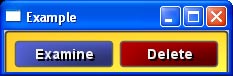
The color of the button is not critical to its operation. It's just a
visual aid, much like the syntax coloring you see in a good code editor.
It is what I call a significant visual clue because we as humans
recognize color quite well. It differentiates the button as something
special. If I had just changed the rounding at the corners it would not
be as effective.
IMO, it's silly to ignore this color dimension of our human preceptive
abilities. (If we were cats, then it would be fine.) We should use it - wisely, of course.
Now, assuming that we can change the color of a button, how do we
indicate this in the GUI?
This question is not as trivial as it seems. In R2 VID and in the
default button style of new R3 GUI, you can write:
button "Delete" maroon
That's how I got the button for the image above.
But, some of you strictly-by-the-book GUI experts will recognize that I've
violated an important rule. I've broken the abstraction barrier. In the
line above, I added a visual attribute (maroon) to an abstract concept
(button). It would be like using the B tag in HTML to stress a word. Oh no! It's verboten! Although... a whole lot of people do it... because it's convenient.
You may ask, is that a good practice? My answer would be that it depends
on your application. If you're writing a tiny reblet for some quick project
or to give away to friends on the net, I'd say: no problem. But, if you're
designing a commercial application for an important client, I'd advise for
you to be more disciplined.
More disciplined? What do I mean?
Well, quite simply, you can easily abstract the above into a new style (our GUI subclass) of button.
button-critical "Delete"
Which can be defined as easily as:
stylize [
    button-critical: button [
        facets: [area-color: maroon]
    ]
]
The advantage is that now all of your critical buttons will be the same
color and you can easily modify all of them in one place, the style
definition.
You might have another button defined for Cancel that gives you a
different color indication, and would be written as:
button-cancel
And also, this kind of button need not even contain text, because the
text would be included in its definition.
stylize [
    button-cancel: button [
        text-body: "Cancel"
        facets: [area-color: gray]
    ]
]
In conclusion, I think that a good design allows both methods. For the
quick app, users can throw in the color. For more serious apps, define
the style. Just like defining a function, it's easy, and will save you
time later.
9 Comments
| 
